We like 👍
How graphic design saved NZ from COVID-19
By Simon Owen
Graphic Artist, Envisage Design Ltd


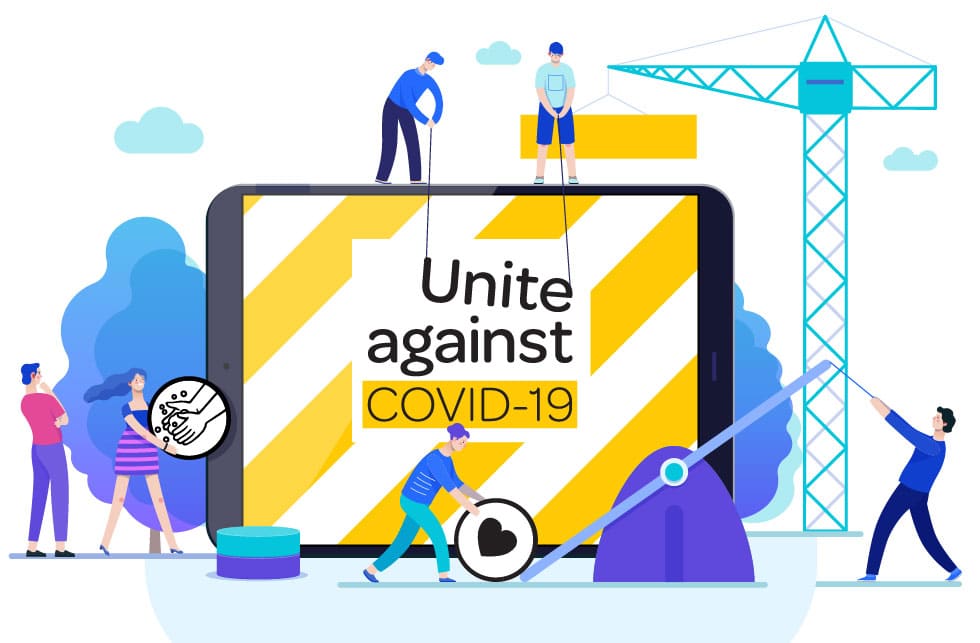
The NZ COVID-19 communications logo is nothing flash. It did not need to be. Just a simple logo with support elements deployed at speed. Read how organic graphic design beat a modern virus.
In 2020, New Zealand was one on the most desirable places to be after it ‘crushed the curve’ and eradicated the COVID-19 virus.
How did phenomenal achievement occur? Well, an indisputable fact is that a team of 5 million (the population of NZ) on a couple of isolated islands at the bottom of the world followed the rules. Kiwis are pretty good at doing what they’re told. So, what aided their incredible effort? Good graphic design, that’s what.
Read on to learn how graphic design saved NZ from COVID-19.
Speed
When COVID unleashed itself upon an unprepared world, the trick was for humanity to act fast. Mass communication is something us humans have gotten down to a fine art, so that’s good.
However, our modern predisposition for endless meetings and second-guessing is second to none. Enter quick and dirty graphic design that shoots from the hip. Often, the very first ideas are the best. That’s survival mechanism kicking in. Great graphic design is purely intuitive. It’s quick!
NZs COVID-19 communications logo is nothing flash. It did not need to be. A simple logo device and supporting design elements was all that was required to be deployed at speed.
- Act fast. Survival
Simplicity
Clour combo yellow and black. Seem familiar? That is because black on yellow is one of the most high impact colour combos recognisable to the human eye. When we are moving at speed we need colour combinations that capture our attention quickly. That’s why yellow and black appears on permanent warning road safety signs throughout New Zealand.

Diagonal stripes. In other words; long, narrow bands differing in colour. Why? Because it is an authoritative meme. Think police cars and caution ‘do not enter’ tape. Contrasting colour arrangement is mother natures way of saying ‘caution – beware!’
NZ communications response to COVID relied heavily on the use of icons. Iconography is the use of visual symbols to aid interpretation. Why use icons? Because humans live in a busy and visually noisy world. Increasingly, icons represent common message themes that do not require lengthy explanation.
- Intuitive design. Identification
Technique
The NZ COVID-19 logo is highly adaptable with thanks to the following built-in design techniques:
Colour:
White works on back. Black works on white. Black works on Yellow. These combinations are useful in various COVID-19 comms design applications.
Icons:
Visual symbols that identify with the highest amount of people possible. Iconography is used to bridge language and cultural barriers. The NZ COVID icons are of equal visual weight, meaning no single icon draws undue attention to itself.
Font:
The NZ COVID-19 logo font reads well in both upper and lowercase. Also, the font comes in various weights, which allows for effective use in various situations like headlines, subheadings and body copy. The soft-curve aspect to the font has a friendly and approachable feel.
Ratio:
The NZ COVID-19 logo is modular. The width by heigh ratio of the isolated logo is perfect; not too tall and not too wide. This ratio means easy placement in various communication situations. Also, the supporting yellow stripes can be tiled for use over various background shapes.
- Die? Adapt!
Consistency
This leads to the most important communications design component; consistency.
Many, many countries completely failed to have an easily-identifiable and consistent message. The disasterous result of this was a muddled message and confusing public instructions. People died.
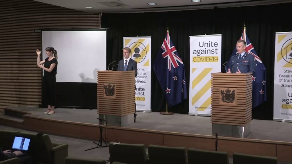
Undoubtably, many people have seen and recognise NZs successful COVID-19 messaging. From COVID-19 banners appearing consistently behind the NZ Prime Minister’s media briefings, to press, video and social media posts, New Zealand’s approach to COVID-19 communication was undoubtably consistent.

Let’s break it down to see how and where the NZ COVID-19 design appears:
- Track and trace in-the-wild QR posters
- Media briefing stage collateral
- Television, social and printed press display advertising
- Mobile app user interface
- COVID testing stations
- Vaccination stations
- Public health spaces
- Nationwide businesses and public meeting places
- Nationwide airports and international departure locations
- Public space signage and floor print decals.
Consistency was made easy due to a simple and highly adaptable design. Let’s not forget however, that the speed in which a ‘that’ll work’ design was implemented in New Zealand.
- Consistancy. Brand.
Conclusion
When designing at speed, throwing a solid curve ball is the best way to target widest known denominators. Once successfully launched, one can expand treatment of the design to suit evolving situations for an achieved result. This is known as designing organically, something Envisage are very good at doing.
In 2020, organic graphic design was New Zealand’s approach to COVID-19 public health communication. With identifiable and consistant graphic design New Zealand crushed the curve.
In 2020, NZ was the envy of the world. This remarkable country continues to be a world leader in viral pandemic communication design response.
Envisage appreciates the power of creative vision. If you have one, we want to talk to you.


